

Not having a reference photo to go by, relying on memory, and these vases and urns i have around the house makes it all the more difficult and challenging at the same time.
I am happier at least that the centres have been toned down and now have some depth to them. They were just too loud and lacked sensitivity. Now, I feel it's going in the right direction and strikes a more melodious tone in keeping with the rest of the composition.
This alteration however resulted in having to paint some of the back petals stronger, using that delicious colour Permanent Rose to bring back some of the vitality of the first version, feeling it needed this, to lift it, and thus making for a nice contrast against all the blue.
I will paint this again from scratch, as i am not entirely happy with the centres looking like they have been re worked... Looking at it closely (IRL) it is a little lacklustre in that specific area, it does annoy me not having the freshness of a first watercolour application.
Well back to the easel with this one!


8 comments:
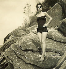
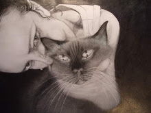
Is that the same picture three times in a row? Whatever, it's a huge improvement, well done! Who's the bathing beauty and why can't I click on her?
LOL...What on earth...you think?
DELETE... I find this uploading very frustrating. "Three times in a row?" Can just imagine the intonation of your voice saying that... funny!
The bathing beauty?...ummmmm
My mother, isn't she gorgeous?
I don't think those images open in the static side of the Blog... that's about all I can come up with...How should I know? LOL
I thought this looked fine in the original version, but I have to admit that the softening of the centres and the subtle inclusion of the same colour in the background, really makes a difference...Beautiful!
I thought the original was great, but the re worked version is simply wonderful. Seems everyone agrees. Your work is going gangbusters despite all the events. L
Sandy... all part of learning... and may I add...
"I HATE WATERCOLOUR!"
OK…now I’m feeling better!
I did like the original too and the vibrancy it had…
However, pink just looked like a blob with no form.
I have to leave this for a while now and come back to it later.
Perhaps after my next Vintage Vase in this set, as I am starting to obsess.
Glad you think it an improvement.
L... thanks for leaving your thoughts.
Glad you like the re worked version.
P
Well, you are certainly proving the worth of your Arches paper!
This is very pretty, yes, I like it better now. Nice work. And very brave of you !
Hi Mimi, thanks for your vote of confidence. Brave, perhaps not, more like fools rush in.
Arches Paper! Love the stuff, and the half price discontinued special was worth driving around Sydney for, even though I have a stack of them now...what did I say... about 80 sheets...I'm still being careful not to waste... What can I say...I'm a scrooge. lol
Did I mention the people in class when I made the announcement...was like the floor of the NY Stock Exchange... money being thrown at me and everyone yelling... BUY!!! BUY!!! BUY!!!
Post a Comment